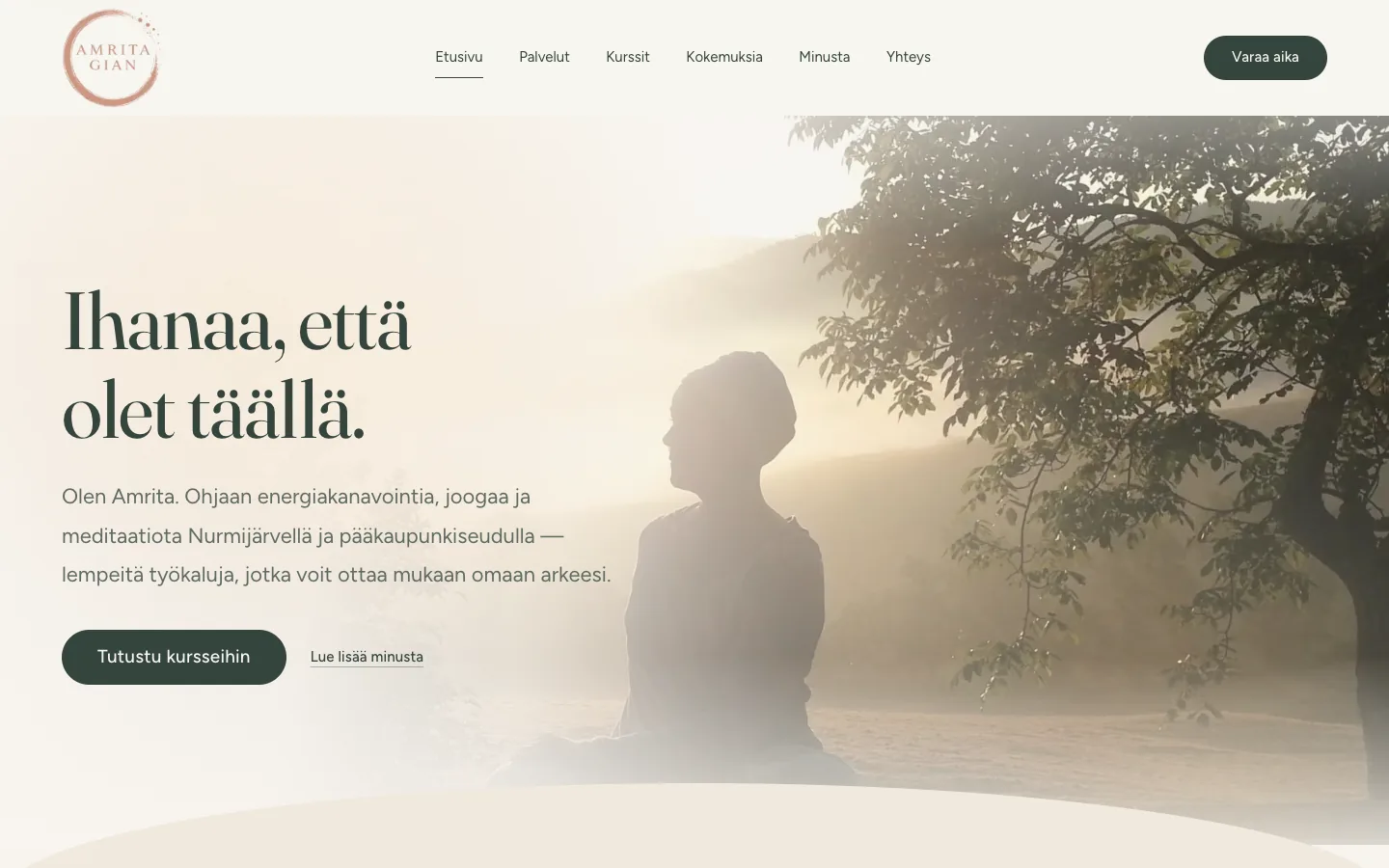
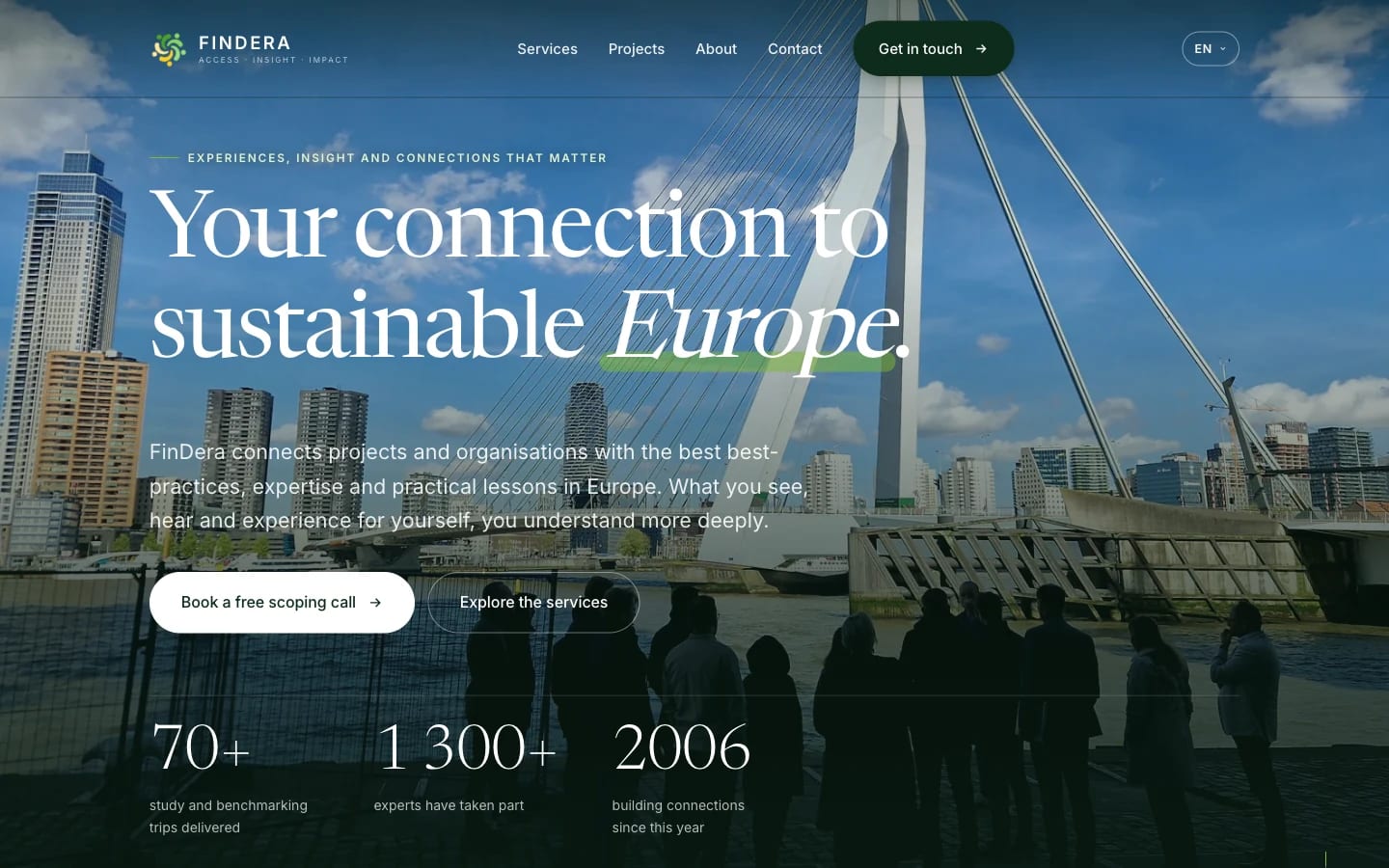
Clarity, trust and considered movement for an expert brand
The company's website was designed to support an expert brand in which clarity, trust and quality visual design go hand in hand.
Work
The answer doesn't come from a template. It comes from understanding a company's goals, its people, and the story behind them.
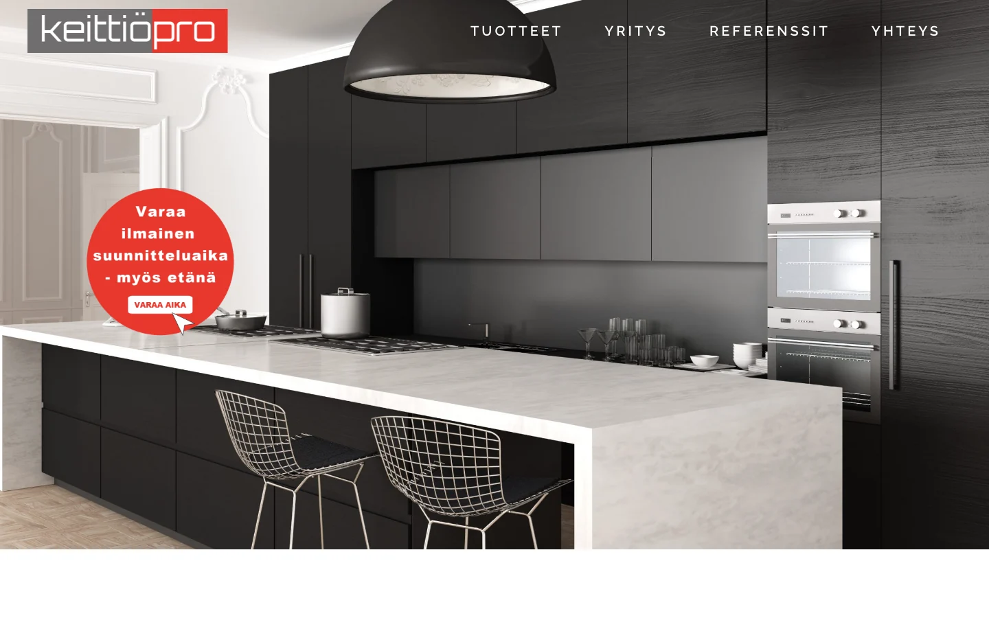
A kitchen company's website, built entirely in WordPress.
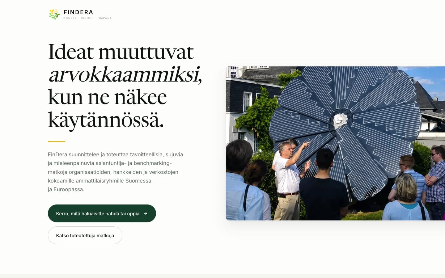
A landing page for benchmarking trips aimed at groups of professionals.
The page was built around a single message: the visitor understands immediately what it's about and can move forward in one click.
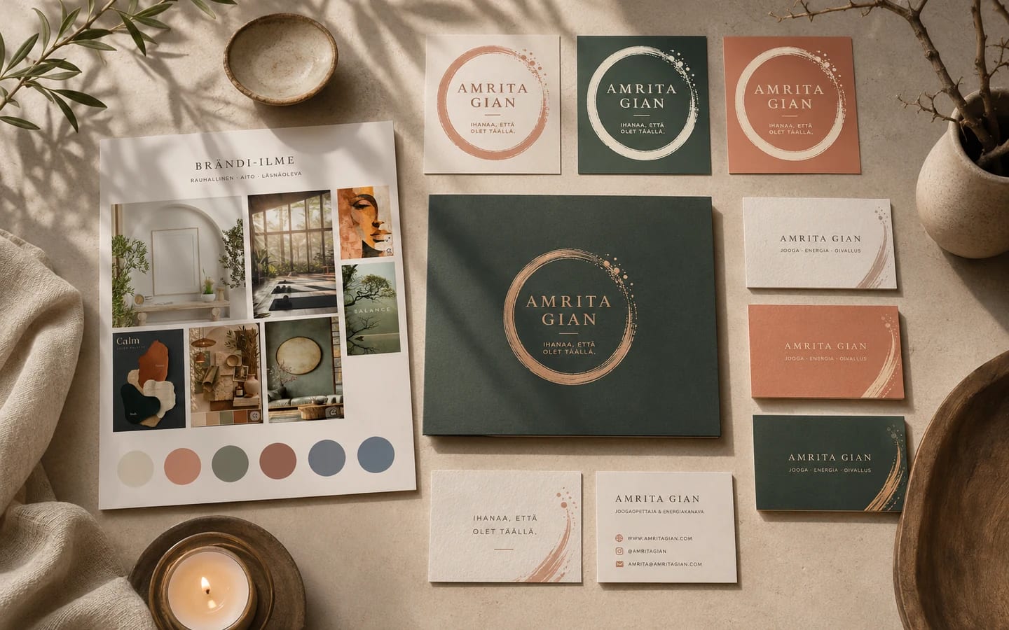
Amrita Gian's visual identity was built around three words: calm, genuine, present.
The whole includes a mood board, colour palette, typography, logo colourways, business cards and other printed materials.
Tell me briefly what you're planning and we'll look at the most sensible way forward together.
Get in touch