FinDera Consulting
Clarity, trust and considered movement for an expert brand
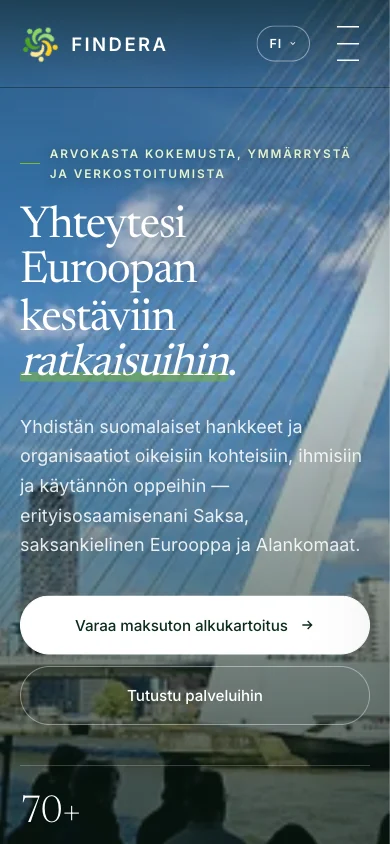
The company's website was designed to support an expert brand in which clarity, trust and quality visual design go hand in hand.
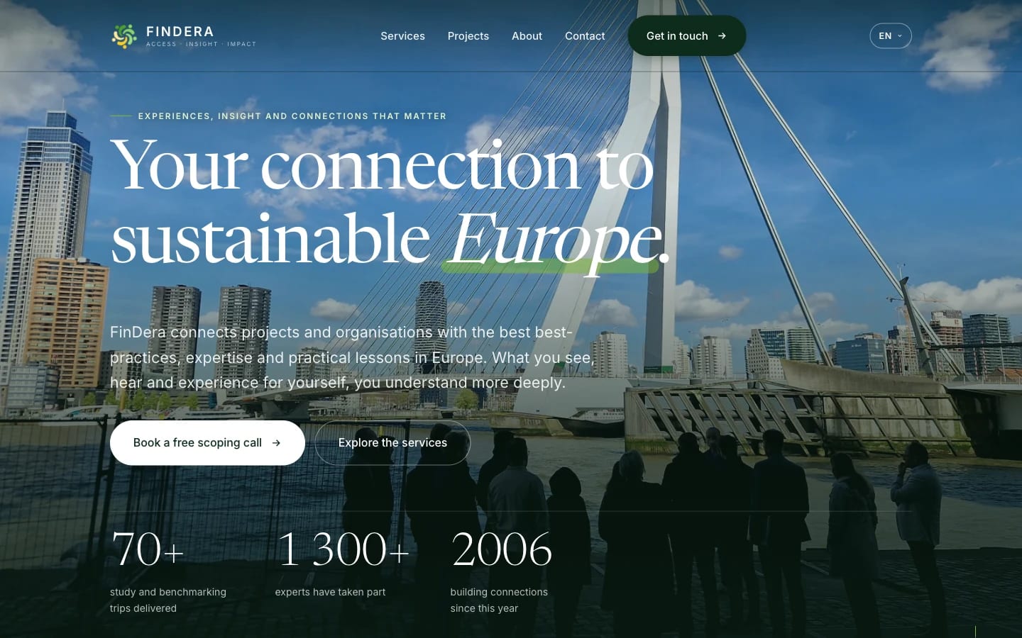
The result is a modern whole in which subtle animation, parallax movement and carefully finished details bring the experience to life without ever drawing attention away from the content itself.
Every page was designed to carry the visitor onwards naturally — into the services, into the work, and towards getting in touch.
The starting point
The client's previous site had been built on an off-the-shelf platform, and it didn't tell the story of the company's expertise the way that expertise deserved. The new site's job was to make long experience visible and easy to approach.
The solution
The structure was built around the visitor's path: what they want to know first, what comes after that, and where getting in touch feels natural. Typography, empty space and restrained movement all support that journey.
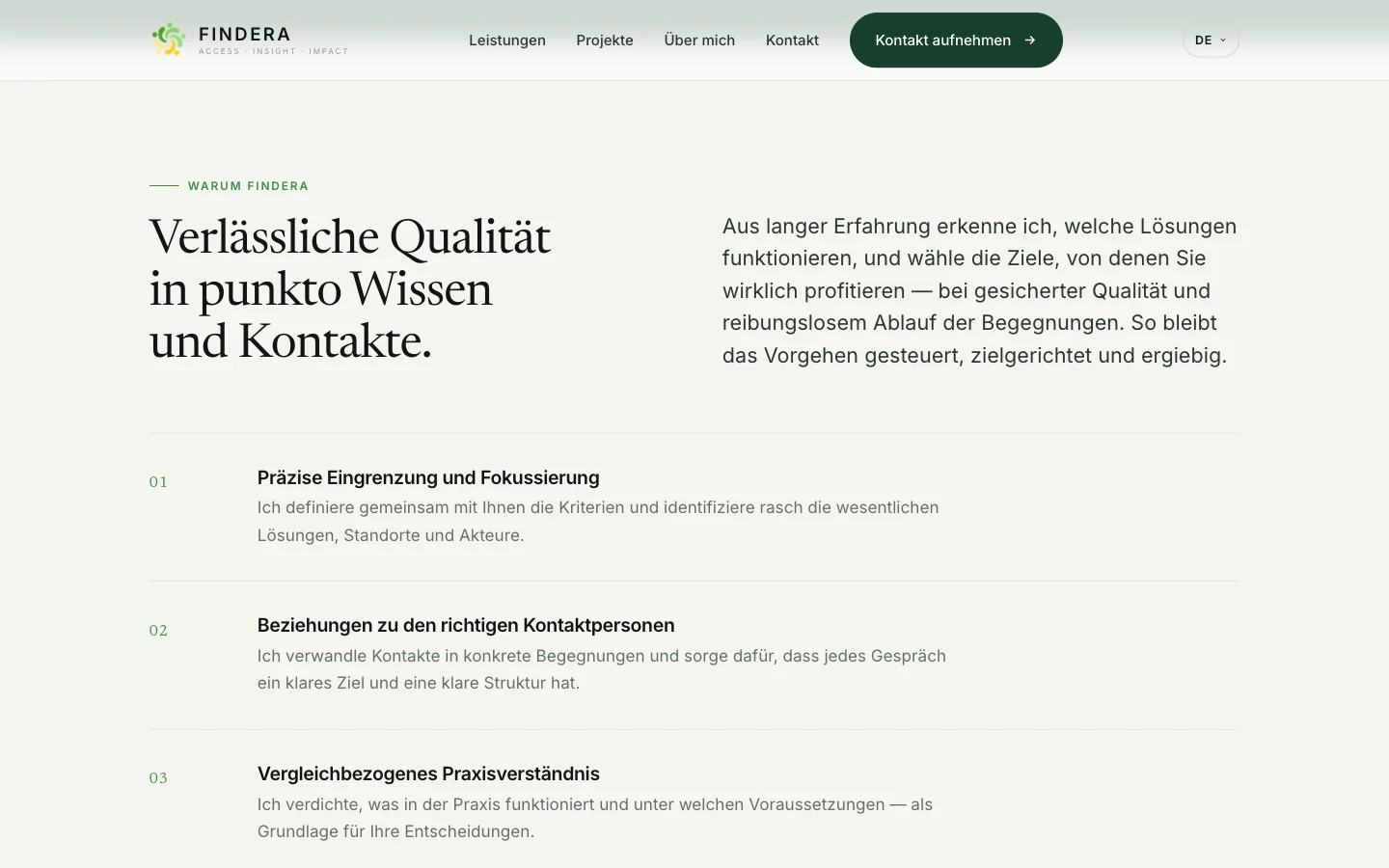
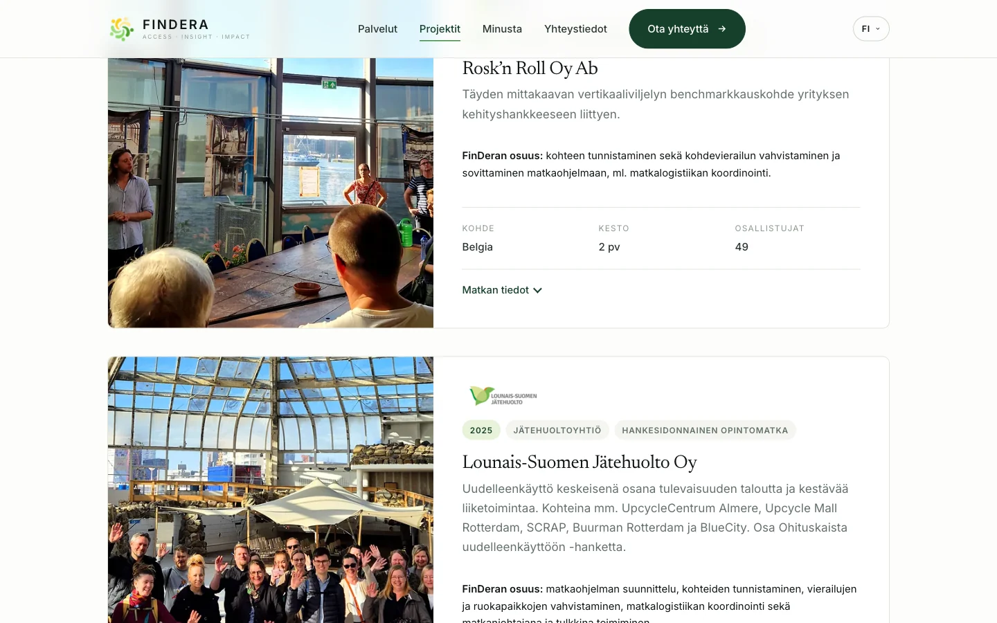
Content was separated from the code so the client can update the texts themselves. The three languages were implemented so that the Finnish content works without JavaScript too, and is fully indexed by search engines.
Project details
- Website design
- UI / UX
- Brand identity
- Responsive build
- Scroll and parallax animation
- Contact form
- Search engine optimisation (SEO)
- Three languages: Finnish, German, English
- Platform: Netlify
Industry
Circular economy and renewable energy consultancy
Next project
Amrita Gian
Shall we build the next one together?
Tell me briefly what you're planning and we'll look at the most sensible way forward together.
Get in touch