
Amrita Gian
A website for a wellbeing business
Amrita Gian is a wellbeing business offering energy healing, yoga classes, intuitive painting retreats and a range of workshops around energy, meditation and wellbeing.
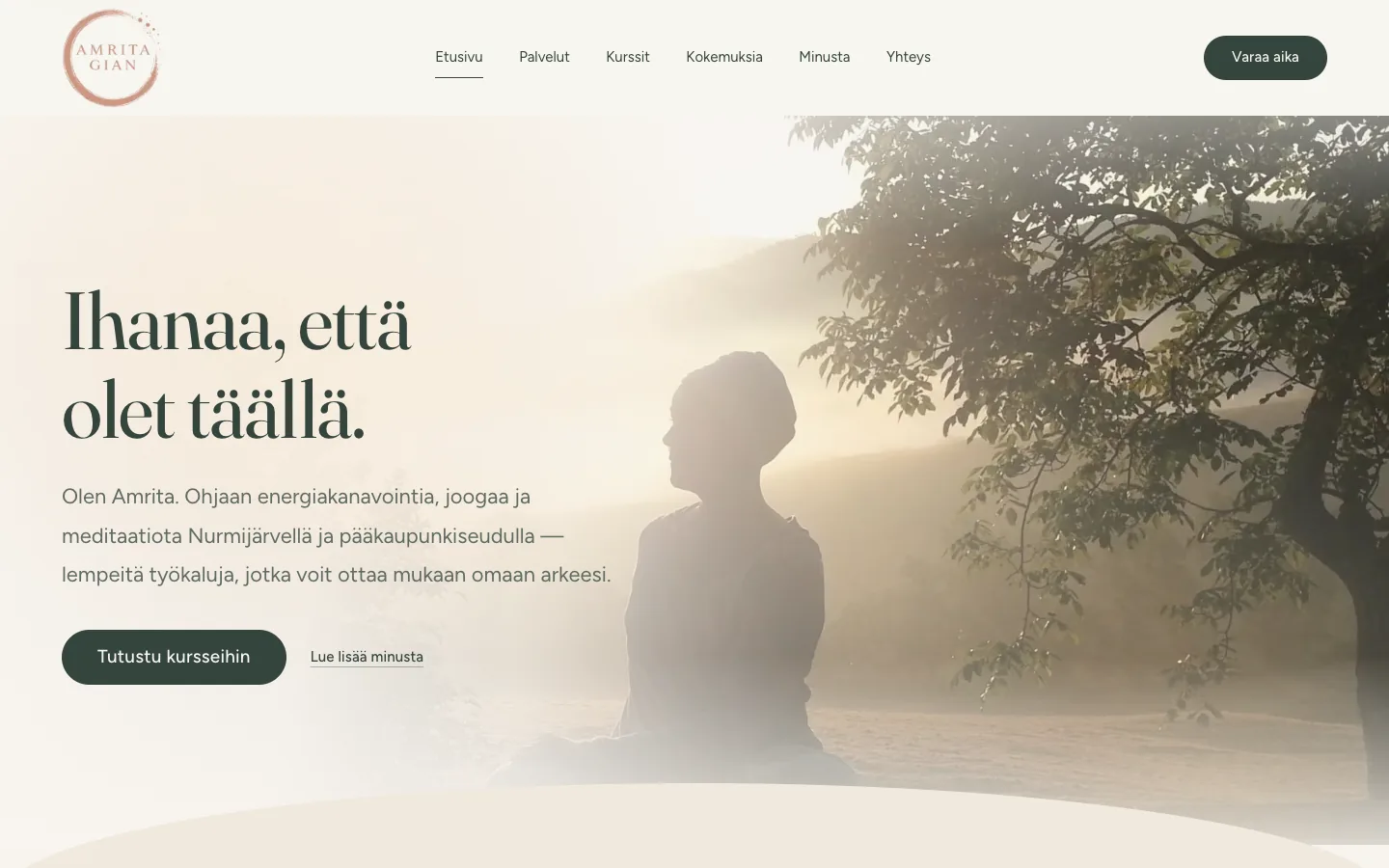
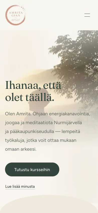
The site was meant to have something like a breathing energy: a calm surface with something alive beneath it. All the movement, colour and typography follow the Brand Book made for the client, so the site feels of a piece with the logo and the printed materials.
The whole was built bespoke rather than on an off-the-shelf platform. That way the identity, the course listings, the sign-up and the deposit that secures a place all belong together, and the visitor never has to step out into an external service part-way through.
The starting point
The previous site had been built on a ready-made platform, and it didn't give the work the calm, trustworthy impression it deserved. The new site's job was to make the services, courses and retreats easy to approach even for a visitor entirely new to the subject — and to bring sign-up, booking and getting in touch into one place.
Breathing energy
The movement was designed as part of the identity, not as decoration laid over it.
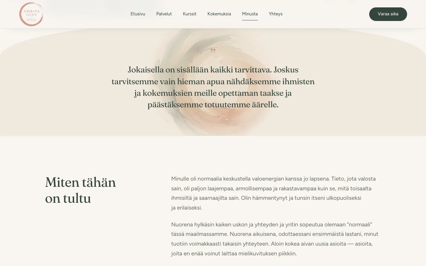
A white aura travels behind the cursor, following with a slight delay and settling the moment the mouse stops. The light on the home page breathes slowly through its own cycle, and on darker, warmer surfaces a light shimmer rises — like dust in a shaft of sunlight. The client's own watercolour art was brought onto the pages to give the text a visual voice and to soften the borders between sections.
The sample at the foot of this page was recorded from the bottom of the site, where the light shows most clearly.
All the effects are gathered into a single settings file, so their intensity can be adjusted — or they can be switched off — from one line. They are genuinely optional, too: the site works perfectly without them, and if a visitor has asked their device for less movement, they are left out entirely.
The solution
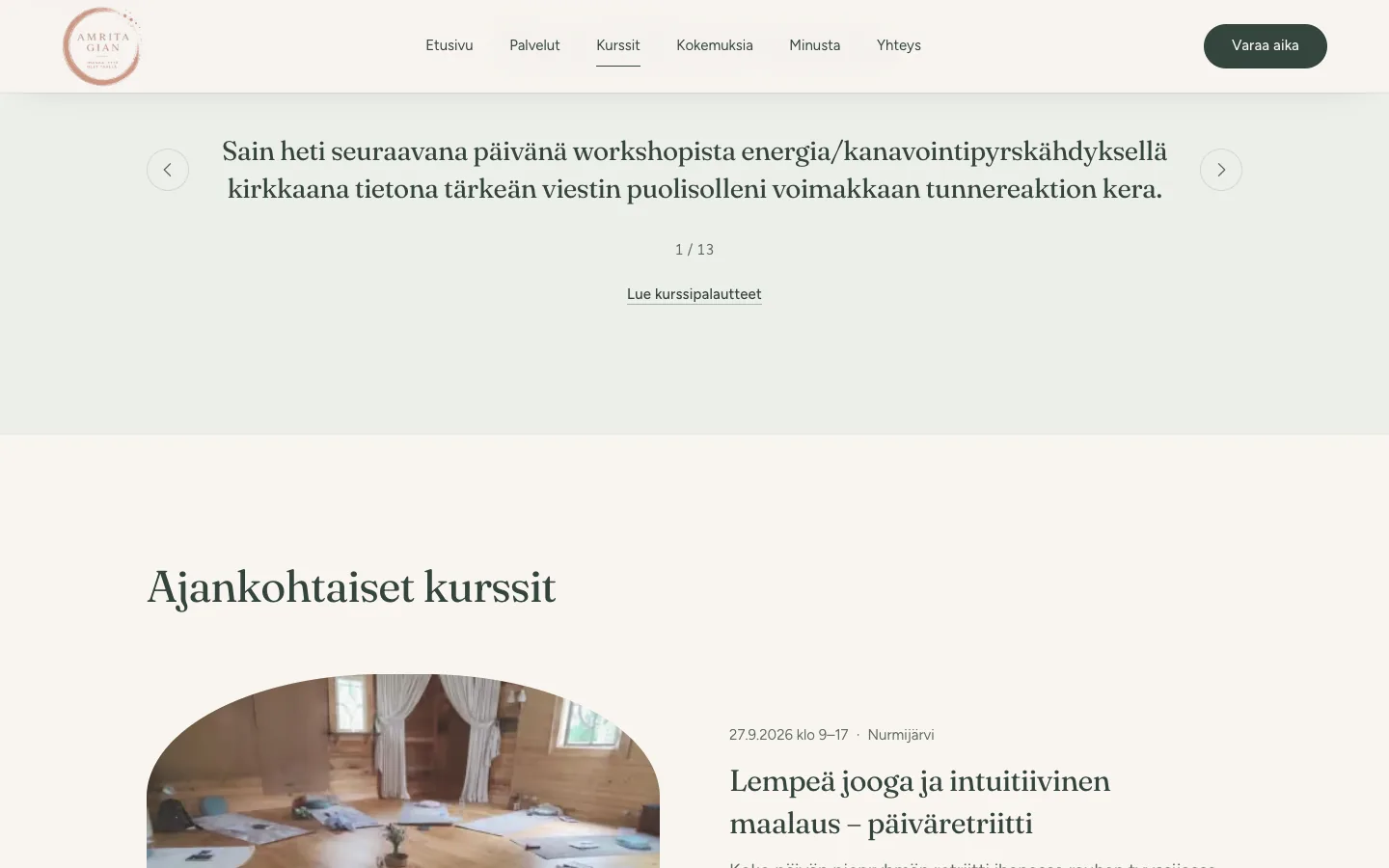
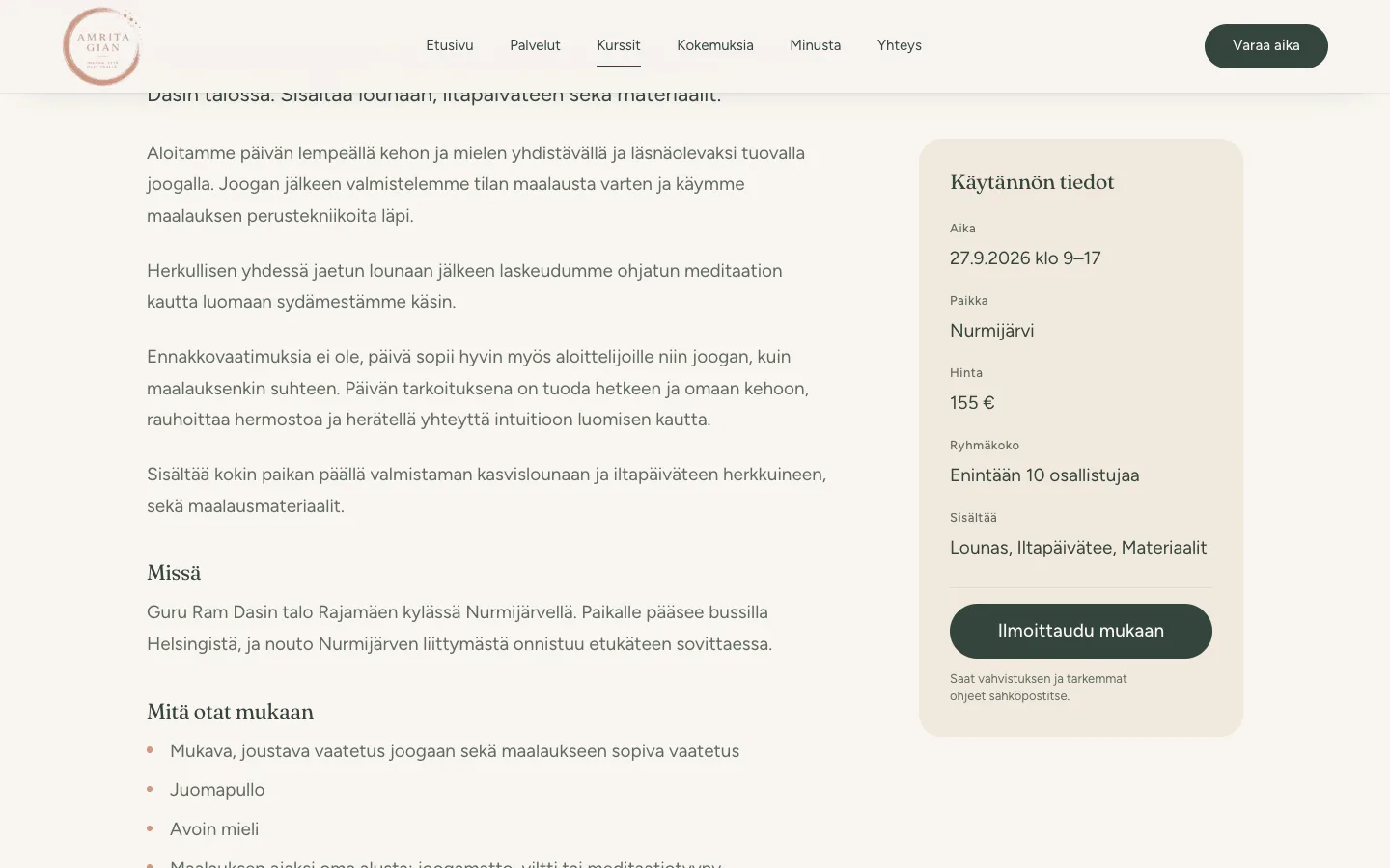
The structure was designed around the visitor's path: what the services are, what happens on the courses and retreats, who is behind the work, and how to join. Every course has its own page with schedule, price, group size and answers to the most common questions. Sign-up and the advance payment are in the same view.
The site has a privacy policy and cookieless visitor analytics, so no consent banner is needed.
Booking is directed to the Vello system the client already uses.
The site in the client's own hands
The site didn't stay tied to the person who made it. The client updates the content directly on the page: text is clicked where it appears, the change is written in place, and saved from a bar in the lower right corner. There is no need to hunt for the text somewhere outside the page, and no separate admin system to learn.
The whole site is editable, not just part of it. The courses are their own thing: a new course comes from a single button, and group size, places taken, sign-up status and a course's visibility are all set from their own panel. When a retreat fills up, it can be marked full without anyone else stepping in.
Signing in happens through a one-time link sent by email, valid for fifteen minutes. There is no password, so there is nothing to forget and nothing to leak, and editing rights are limited to separately approved addresses.
The editor can't reach the site's structure, appearance or code — only its content. That is deliberate: the content is free to change, while the considered whole stays put.
An online course platform is also in progress for the site, which will keep the course material in the same identity and at the same address as the rest of the site.
The same client's brand identity is a project of its own: mood board, colour palette, typography, logo colourways, business cards and other printed materials.
The site can be seen at amritagian.fi.
Project details
- Website design
- UI / UX
- Visual identity and motion design
- Responsive build
- Course listings and sign-up
- Advance payment via the Holvi shop
- Course feedback and experiences
- Contact form
- Privacy policy
- Accessibility and reduced-motion support
- Cookieless visitor analytics
- Search engine optimisation (SEO)
- Content editor for the client: the whole site is editable
- Online course platform (in progress)
- Integration: Vello booking
- Platform: Vercel
Industry
Wellbeing, energy healing and yoga
Next project
FinDera Consulting
Shall we build the next one together?
Tell me briefly what you're planning and we'll look at the most sensible way forward together.
Get in touch